
★ Special Mention, Health and Wellness · Singapore Good Design Award 2024
DBFS 3.0
A tablet test that screens patients for early cognitive decline, redesigned so sessions are shorter and easier to follow.
- Context
- Neurowyzr's medical-grade cognitive screen, used in clinics. Version 3.0 was a full rebuild of the experience.
- Problem
- Sessions ran past 25 minutes, instructions needed high literacy, and patients couldn't tell practice from the real test, so the clinical data suffered.
- My role
- Main product designer: clinician and patient research, three prototype cycles tested with older adults, the design system, and build support with engineering.
- Outcome
- Shipped and in clinical use. Fewer stops for clarification, more reliable data, and a new screening setup is now a settings change instead of a rebuild.
- Client / Org
- Neurowyzr, Singapore
- Year
- 2024
The product ecosystem
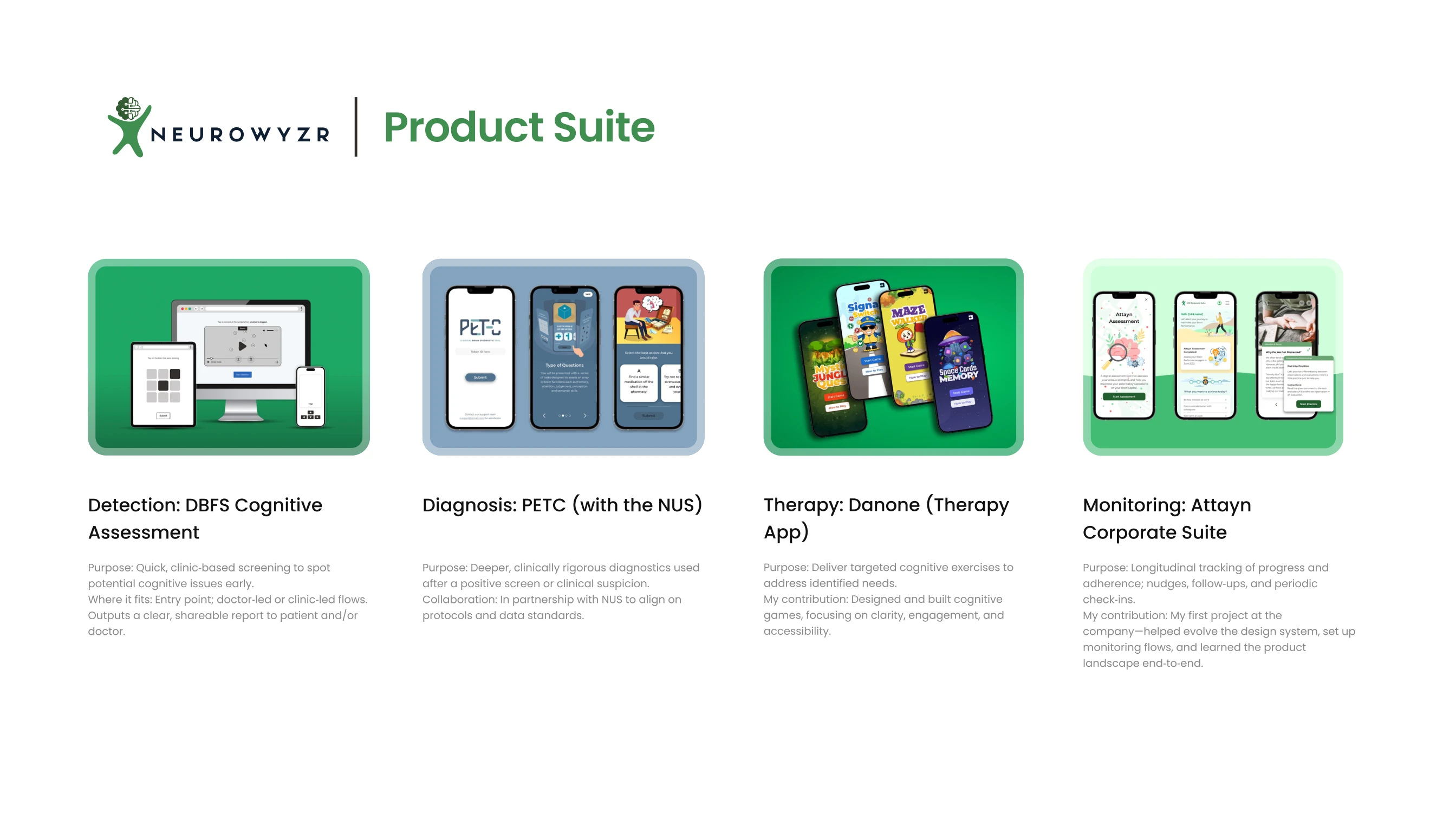
Detect, diagnose, treat, monitor.
Neurowyzr works across detection, diagnosis, therapy and monitoring. DBFS is the detection step: patients complete game-like tasks on a tablet to screen for early cognitive decline, and the results inform clinical decisions.
The problems
Three problems, one screen.
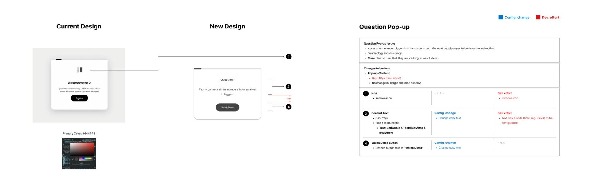
Sessions ran past 25 minutes, text-heavy instructions demanded high literacy, and patients could not tell practice from the real test. Staff stepped in constantly, and the clinical data suffered.
- Comprehension
Instructions, demo and test looked the same.
- Accessibility
Older users, every screen size.
- Configuration
Every new clinic meant developer work.
The journey before the interface
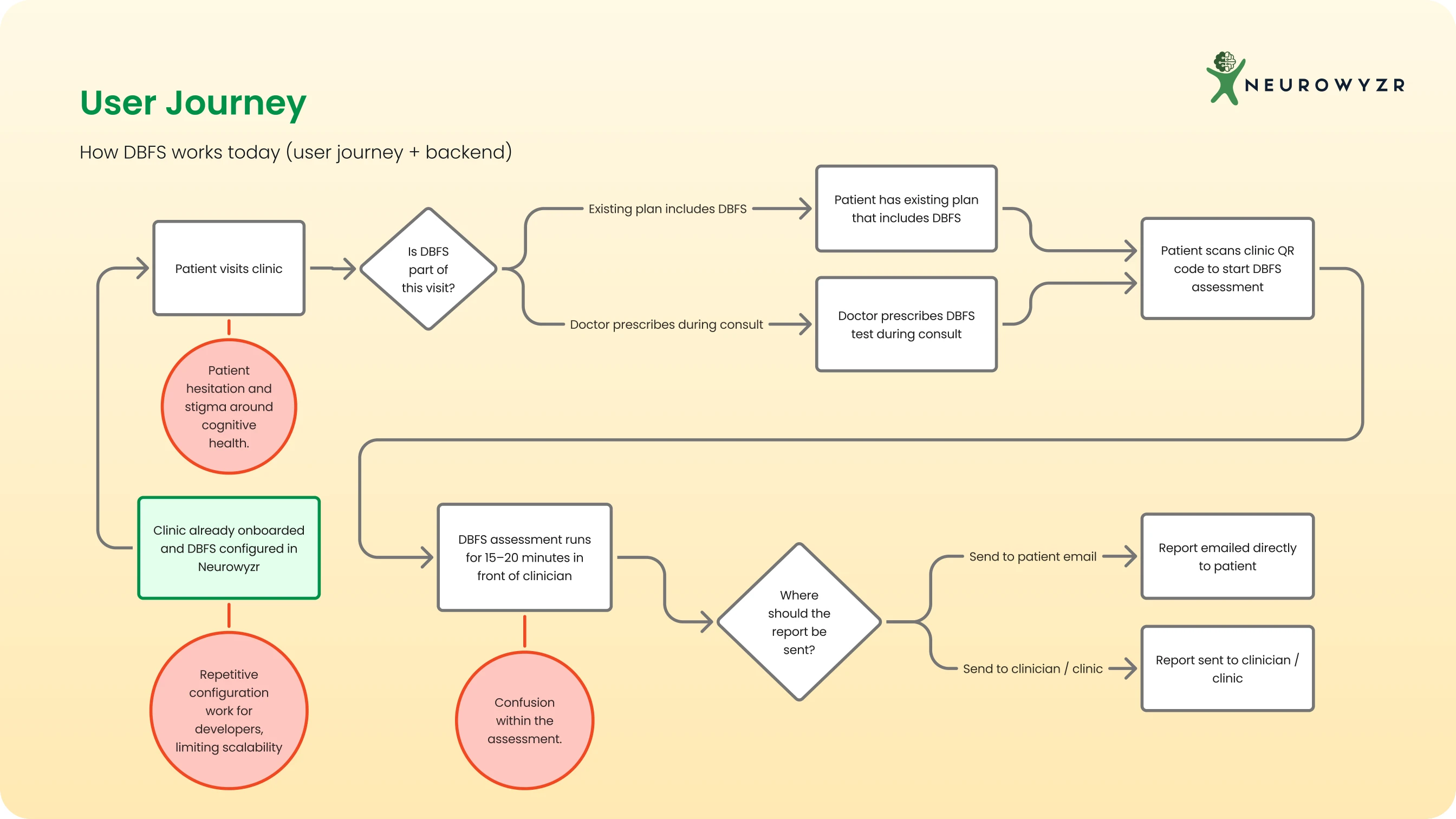
The clinic is part of the product.
A QR code, a prescribed assessment and an emailed report sit inside a wider care journey. I mapped those handoffs before redesigning a single screen.
Research
Find the pattern behind each complaint.
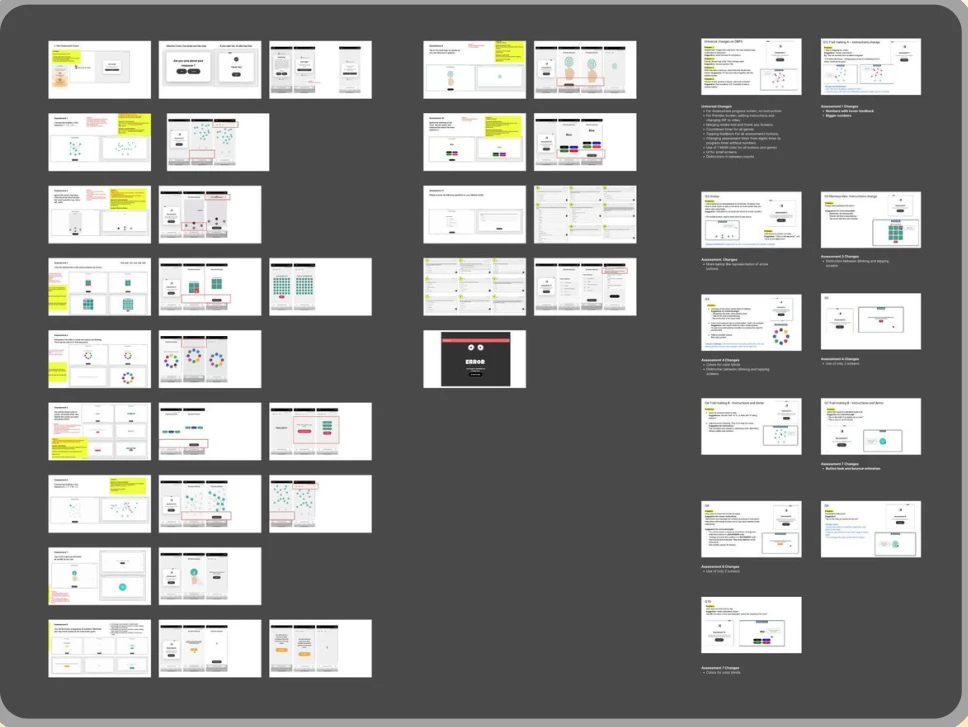
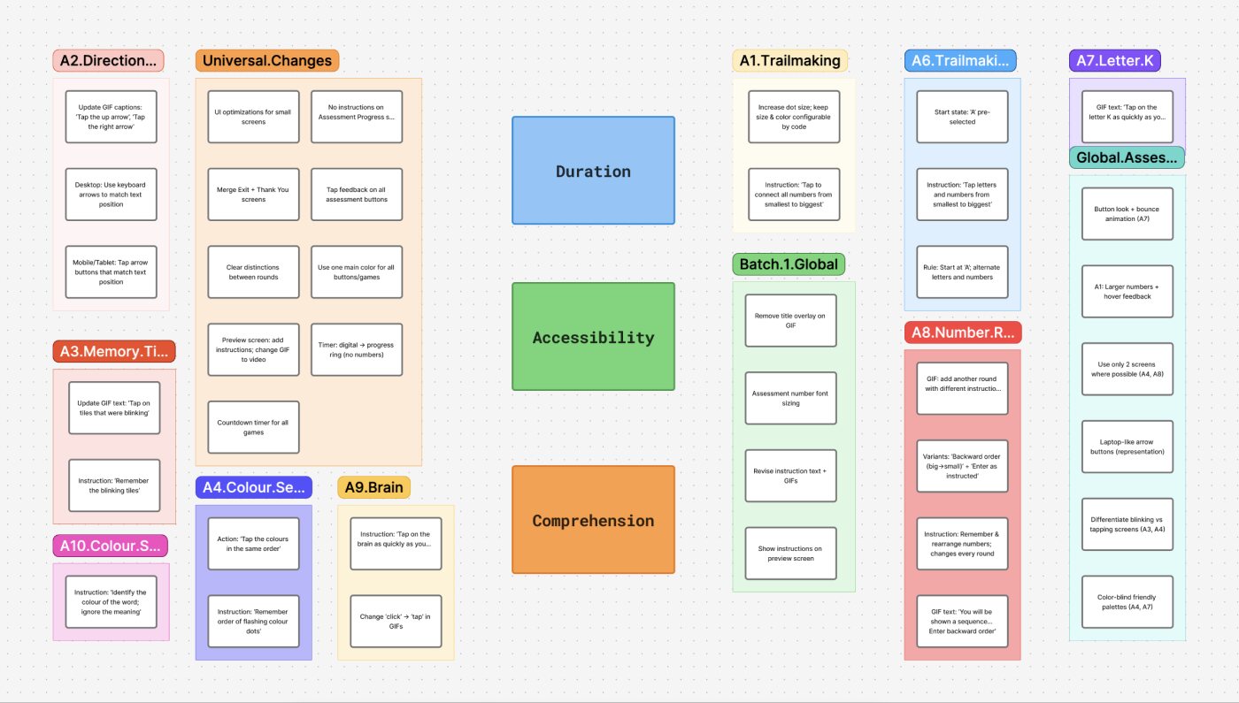
Clinician and patient interviews surfaced the issues. Affinity mapping grouped them into three themes, duration, accessibility and comprehension, and set the goal of cutting session time by at least a quarter.
The system decision
Every question, three areas.
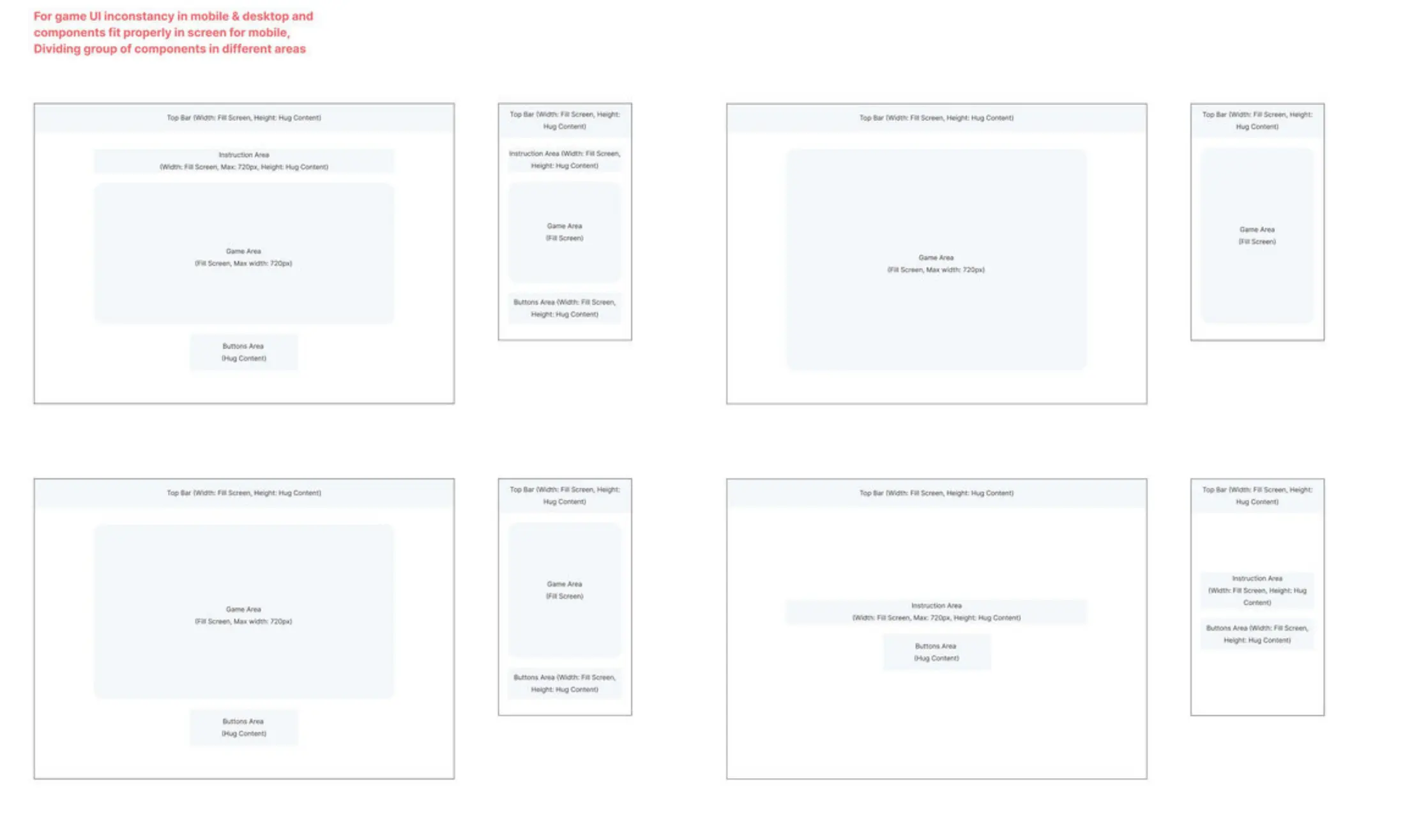
Every question became the same three areas: instruction, game and buttons. One screen model meant a clinic’s assessment is configured, not rebuilt.
- Instruction
- Game
- Buttons
Iteration
Three drafts, three rounds of testing.
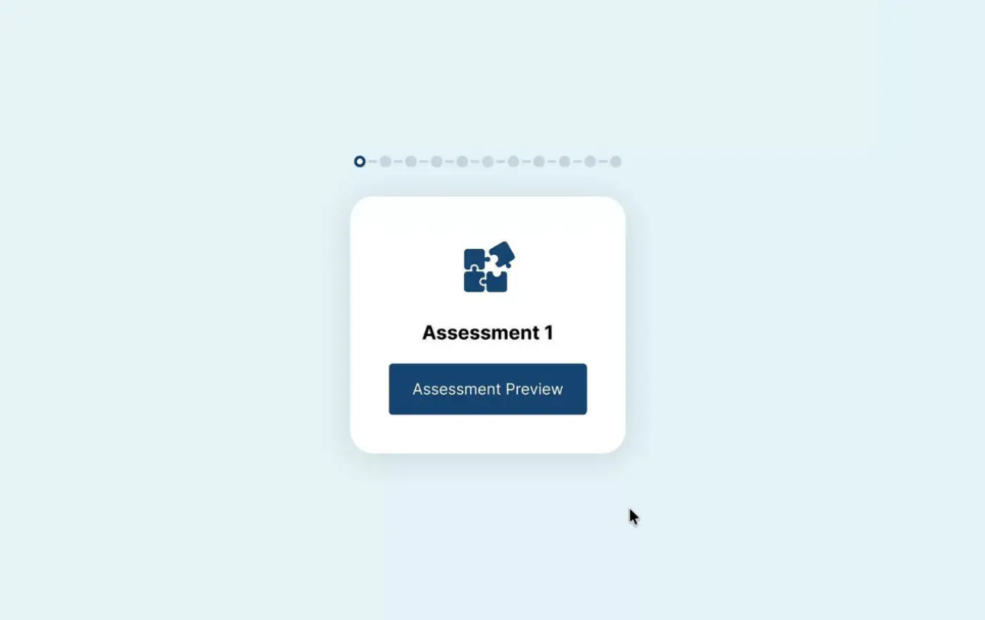
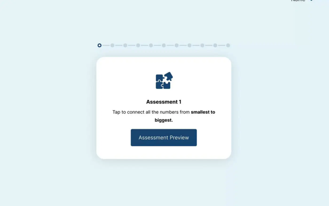
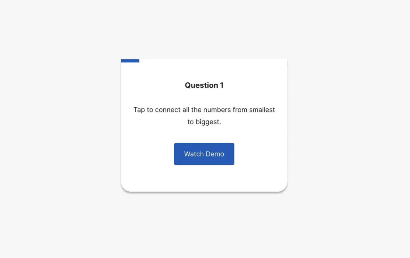
Each draft was tested with older adults and clinicians. The first checked the layout, the second the instructions and micro-interactions, the third the near-final patterns across assessments.
The final flow
Each state has one job.
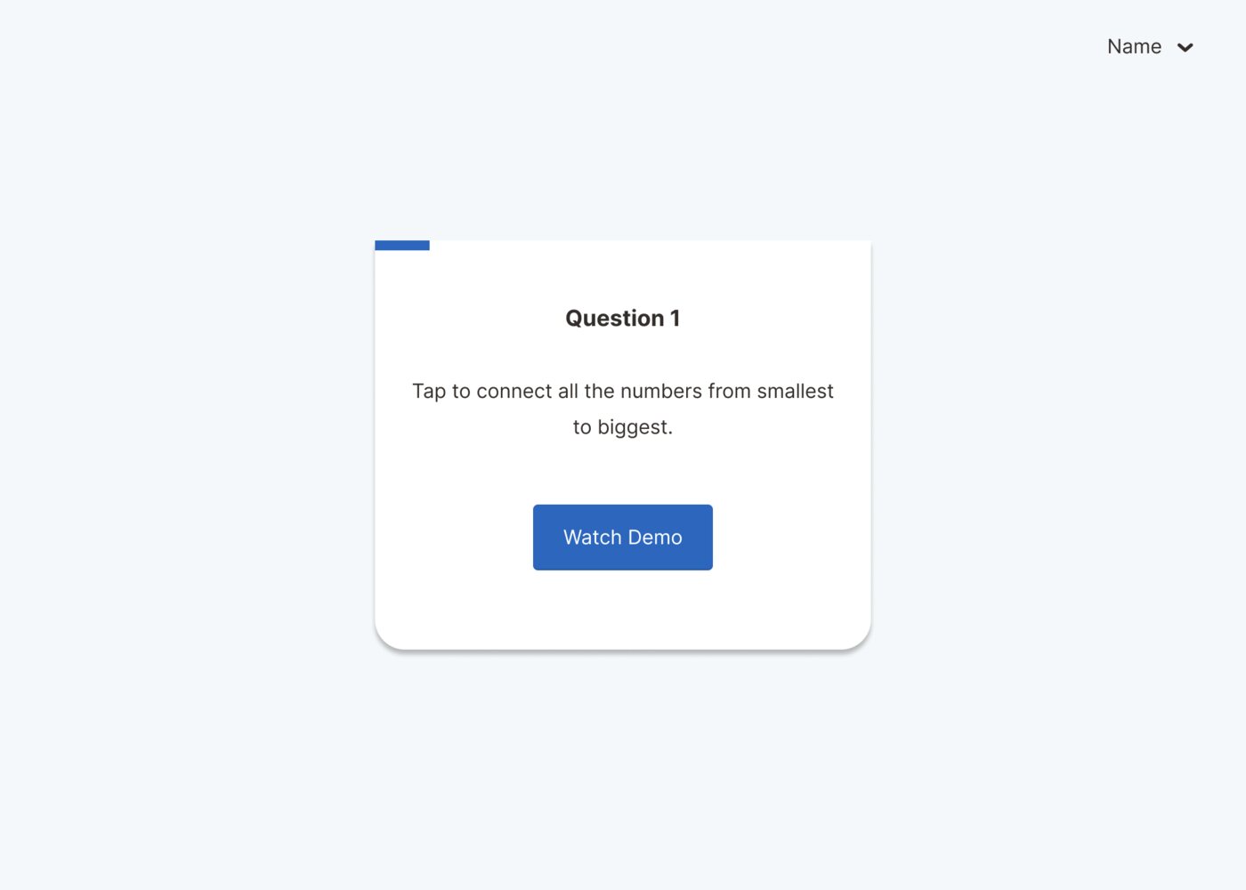
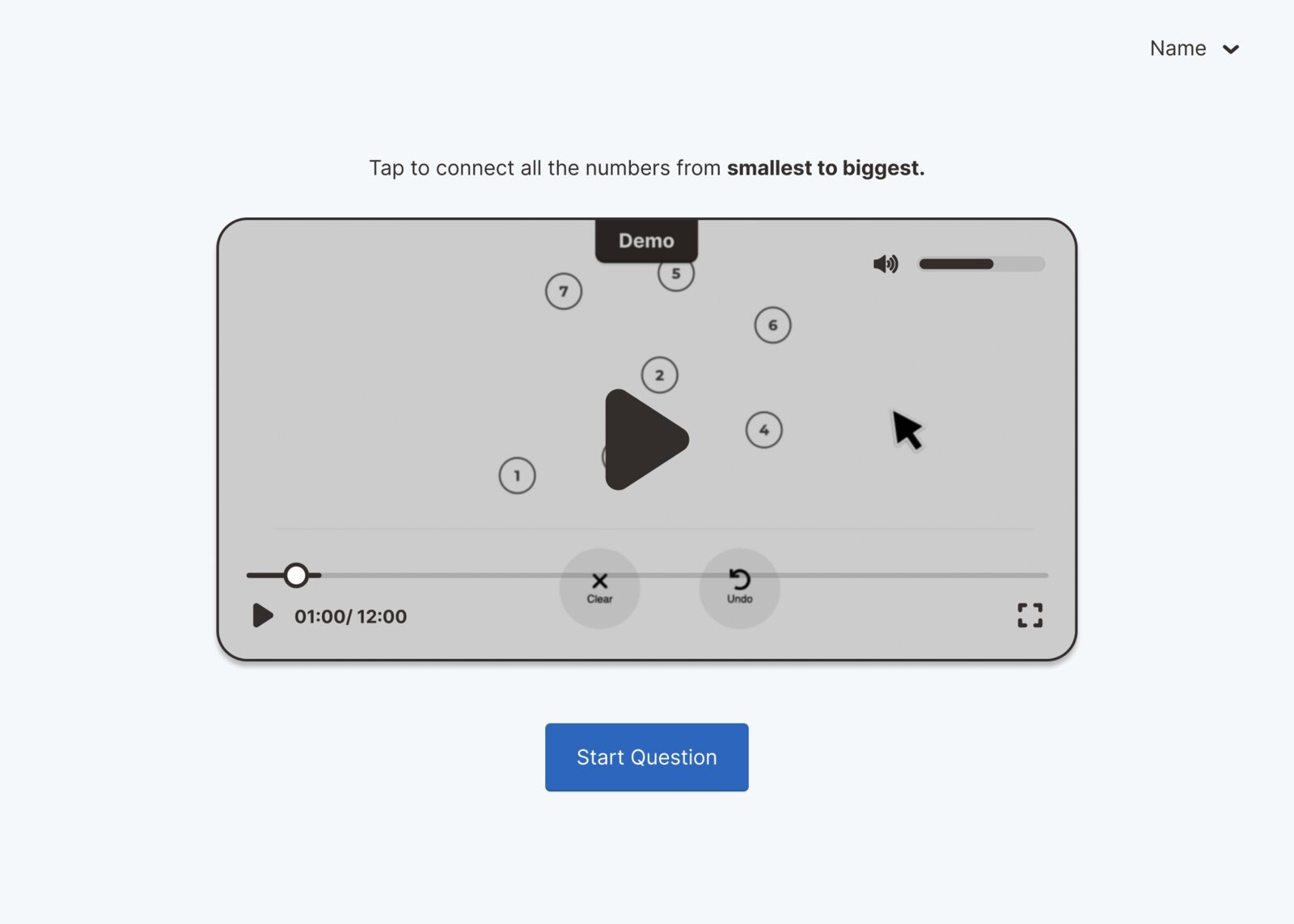
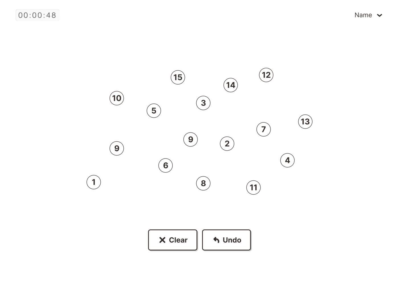
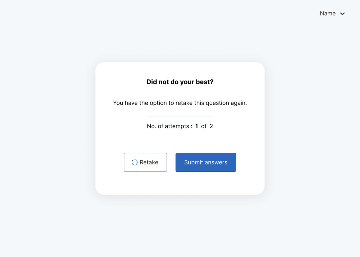
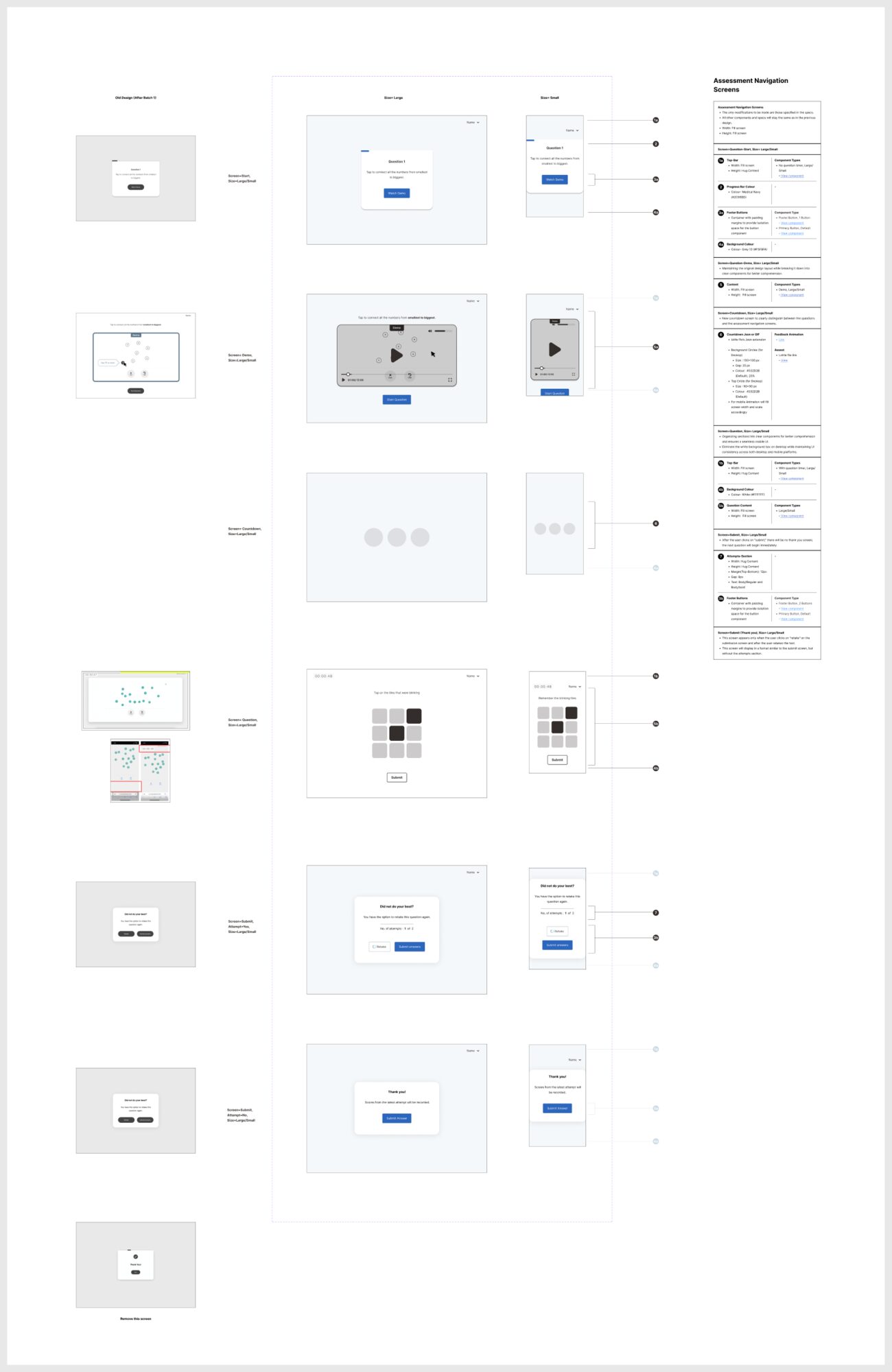
Introduce, practice, prepare, assess, confirm. Countdowns and clearly labelled demos tell patients whether they are practising or being tested.

The design system
The work underneath the screens.
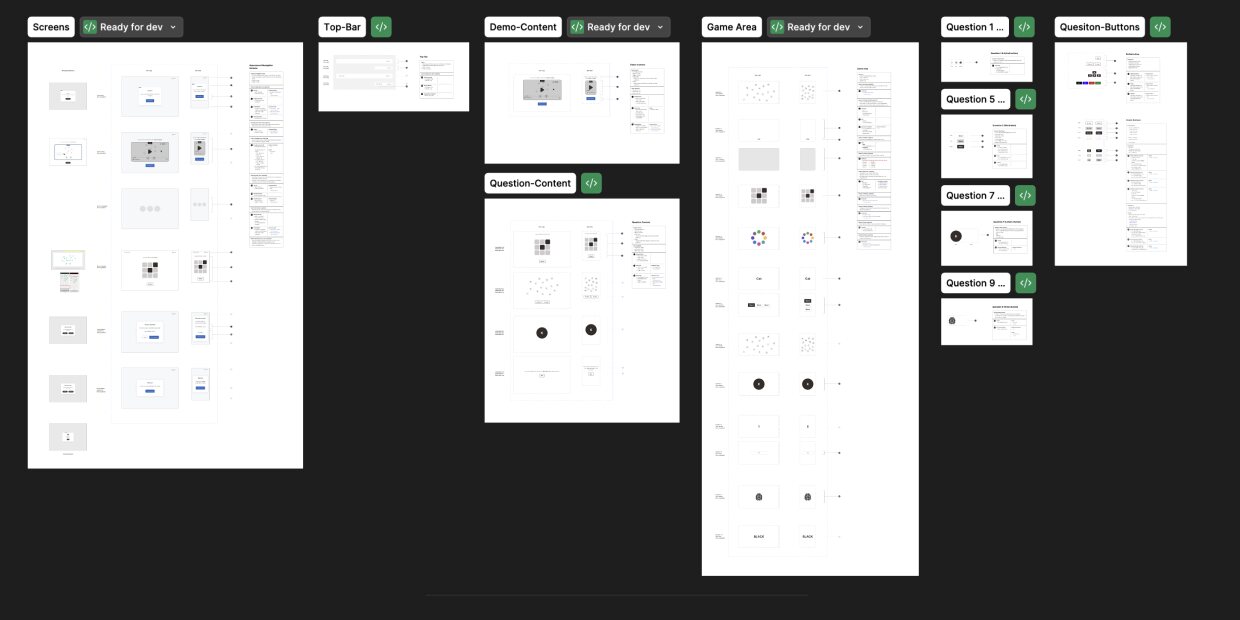
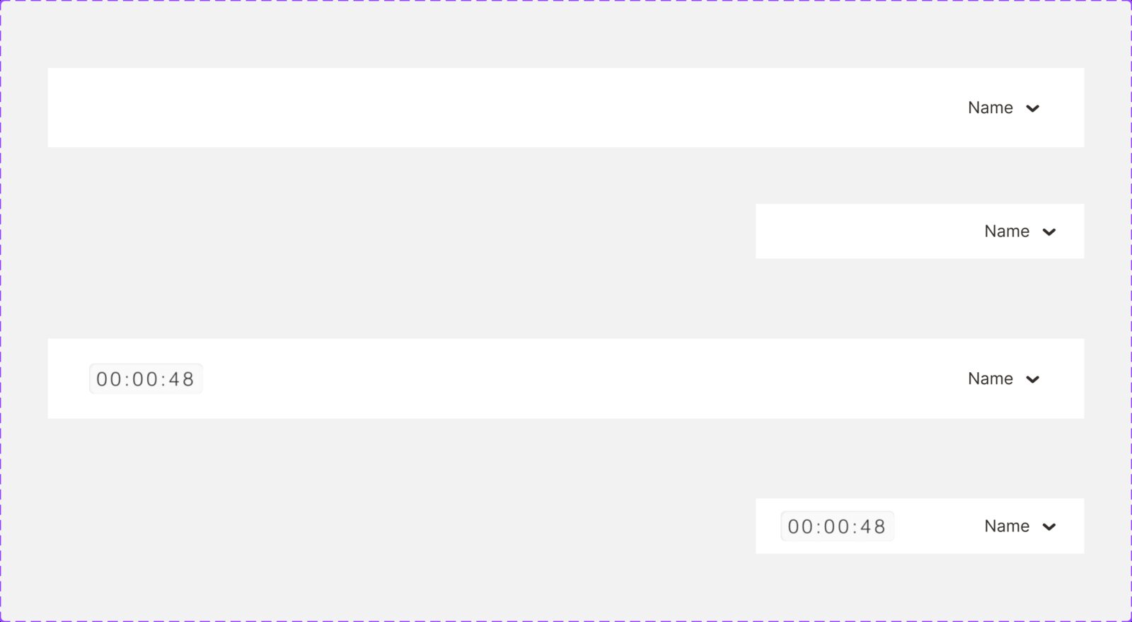
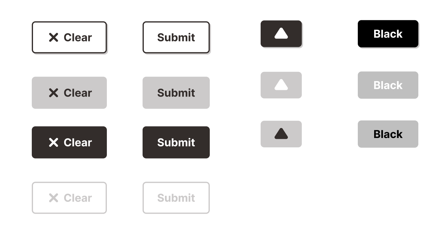
Typography, components, states, contrast rules and full screen specs, documented and built with engineering. A new screening setup is now a settings change instead of a rebuild.

Responsive
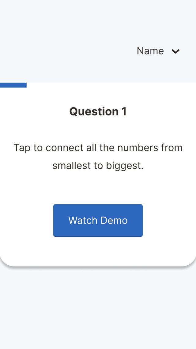
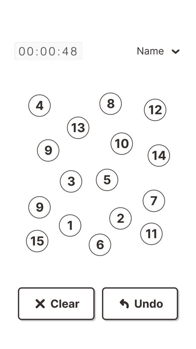
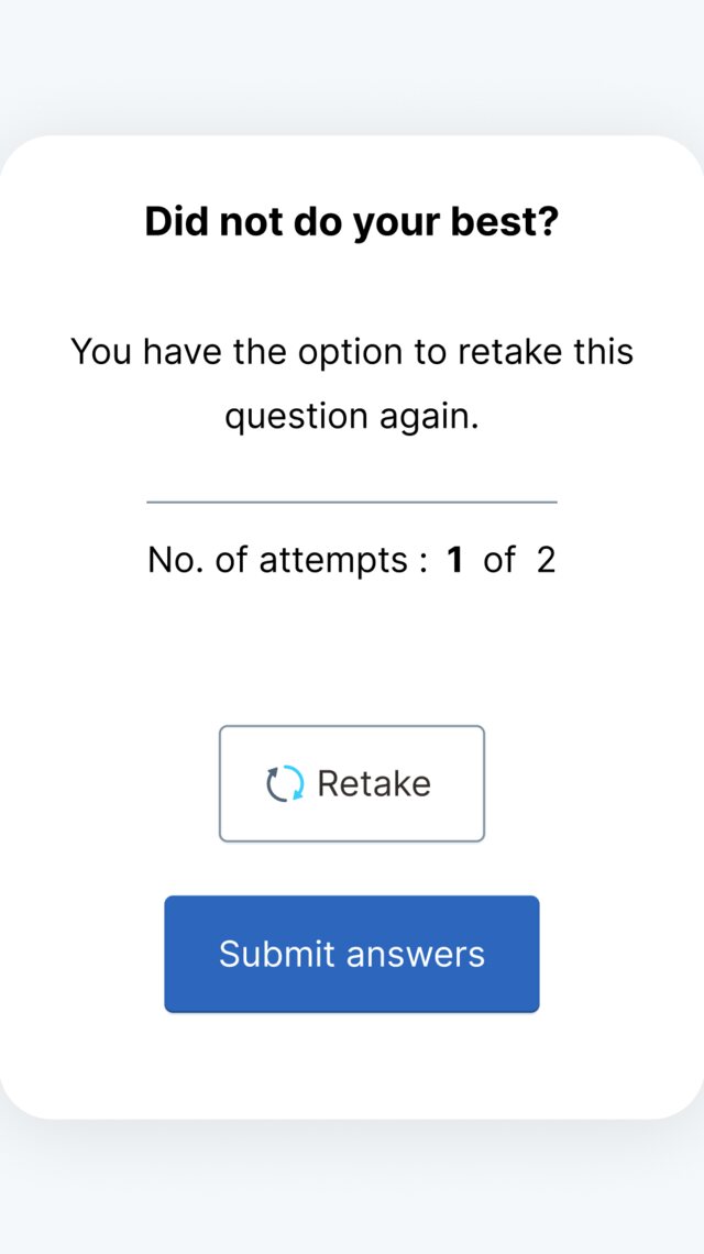
Same language, smaller screen.
The same model and components carry to phone layouts.
Beyond the screen
A film for the clinic waiting room.
An explainer film for clinics, so the test does not feel like an isolated moment.
Simplicityhiding complexity.
Shipped and in clinical use. My first design system.